Friday, February 28, 2014

Fairytale Reservation 2014


Illustration for the Fairytale Reservation project (Заповедник сказок).

The Fairytale Reservation, in its fourth year now, is a collaboration between writers and illustrators. Writers submit stories, illustrators pick the stories to illustrate, and the whole resulting collection ends up published as a book. Fantastic stories of all kinds are encouraged.

I ended up illustrating an actual Christmas carol, believe it or not. I mean it as a genre, not a religious holiday thing - a story of redemption and new life triumphant that happens around the longest night at the turn of the year. Here an old ex-military officer who all but lost his will to live after his wife died, finds it again after deciding to play an impromptu, awkward Santa Claus for his grandchildren.

The book is going to come out in the middle of 2014. You can subscribe here: http://kroharat.livejournal.com/381309.html


Tuesday, February 25, 2014

Print testing

New prints in making. Strips of test printout laid over originals (and in a couple cases, previously calibrated printouts) for color matching by eye.

There is no other way to achieve color fidelity. No matter how good the hardware is, in the end you have to test the actual printout - and tweak, tweak, tweak. You can see my notes on the test strips, specifying what needs to be done to the spot colors and the source images overall.

Sunday, February 23, 2014

Primary colors


The pink of sakura flowers is precisely the same pink of spring kimono fabric.

We also have all primaries - red, green and blue - here.

(Photographed in Jerusalem arboretum yesterday. Girl in kimono from here. )

Sunday, February 16, 2014

Old books: Manual of Graphic Techniques


I have a number of old (and sometimes odd) books in my library.

Now, my library is heavily skewed towards books on art, picture books for children, art manuals and reference material. And I love used book shops, so I have accumulated a few old and mostly forgotten specimens of treatises on how to make art.

One of these is the Manual of Graphic Techniques for Architects, Graphic Designers, and Artists by Tom Porter, Bob Greenstreet and Sue Goodman. I had first encountered it in a friend's collection, and knew I had to find one of my own.

The Manual is not a single book, but rather a set of four numbered volumes. It was published in 1978.


This is probably the single most disorganized art manual I had ever seen. Its volumes are not thematic; it jumps from topic to topic like a wild antelope, covering bits and pieces on everything from what kinds of pen nibs there are and how to construct the quick-and-dirty perspective plots from an elevation to fine points of silk-screen printing and mixing plaster of Paris. Then it starts all over again, discussing other ways to do perspective plots, page layout for print, using a modelscope and ways to simulate halftone in ink drawings. And so on. Some topics (like silkscreening) are presented only once, but some (like perspective) get sections in several volumes. It is organized somewhat thematically (most of presentation technique is concentrated toward the end, most of the drawing toward the beginning), but is still haphazard enough to make finding something for quick reference a bit difficult.

But what it lacks in organization of material, it makes up in thoroughness.  It covers topics from abstract composition and type design to marbling paper, etching glass and tips on working with glue when making models.


There is little wonder that the contents are heavily leaning towards architect's interests - I was not able to locate Tom Porter with certainty, but Robert Greenstreet teaches at the School of Architecture and Urban Planning of the University of Wisconsin. But there is a lot of general drawing, plotting and presentation techniques. Not everything here is of use to an artist, but nearly every artist could find something of interest in this book.
Speaking of presentation, the book itself is beautifully designed. It forgoes long text for short, clear snippets with relevant illustrations, arranged in almost comic-book panel layout. The graphics are more reminiscent of technical manuals than of art books, all crisp black and white, relenting for only a few pages to color. Even the typeface the text is set in is reminiscent of a typewriter: each page feels like an architect's presentation. And the condensed but very readable layout matches the very practical content. This is not a theoretical book; it is hands-on and focused on you getting the job done.


Of course, any art manual dating from before the personal computer revolution inevitably reads a little like a history of forgotten techniques. There are a lot of pages in the Manual dedicated to methods which are no longer used or fallen into disfavor. But for me, it only adds to the charm. And just like knowing how to do calculations in one's head or on paper is slower than using an electronic calculator, but gives you a ground on which to base your intuitive grasp of arithmetic and predictive skill, knowing how to plot a perspective by hand greatly enhances your intuitive grasp of its laws. History is not dead; the past still influences the present with tradition, terminology, context.

That's why I love old books.

Sunday, February 9, 2014

Africa


In 1903, the British government had offered the revitalized Zionist movement a strip of land in Uganda.

The Ottoman empire held what is now Israel, Jordan and parts of Syria under its rule. They weren't in any hurry to let the Jews live there, and large parts of Europe, especially Russia, also didn't like the Jews much. By early 1900s, another wave of pogroms in Russia sent the Zionist Congress seeking an urgent escape way, and they did consider Africa as a very possible venue. Some considered it as refuge  until the return to the actual historical Land of Israel could be made; some thought that any place to live in peace would be better than living in hostile countries, historical ties or not; and some thought that temporary solutions often become permanent, and agreeing to go to Uganda would de facto void their claim to the Land of Israel. Nonetheless, the Zionist Congress went as far as sending a investigatory expedition there, which found that the climate was suitable but the land was wild, and the local Maasai warlike. In 1905, they decided to decline the Uganda solution.

This tiny piece of history is still remembered in Israeli politics, however.  Uganda is tossed around whenever someone gets accused of not caring about the historical ties of the Jewish nation to the Land of Israel, and putting the importance on a safe haven alone.

So you occasionally get little puns like this final project of design student Yoav Gati, fusing the Israeli paraphernalia with African motifs. Not that it would really happen if the Jews had settled on the Mau Escarpment in what is now Kenya: they insisted on carrying their old colors and symbols everywhere, and though the orange-green-yellow-blur-violet flag is quite decorative, they'd probably still fly the same blue-and-white one anywhere.
 

I find it highly ironic, though, that Yoav's takes on the African-Israeli currency actually look better than the real modern Israeli currency:


Sunday, February 2, 2014

Dancer lighting study

Lighting calculation for a picture in progress. This is easily the most complicated study of this kind I've done to date.

Drawn in black and grey pencil. The stroke direction follows the light angle: this is to keep track of the correct angle at all times.


Tuesday, January 28, 2014

He needs to be about 20% cooler

So I have watched Hobbit: The Desolation of Smaug.

If the first installment was mostly material from the book with bits of new material, the second one turned out to be mostly new material with a few bits more or less from the book.

I get a distinct idea that Peter Jackson is trying too hard to out-LoTR the LoTR movies. Unfortunately, where LoTR was epic and faithful to the source, Hobbit throws the source off Orthanc and tries to lay the epic too thick till it gets ridiculous. Dol Guldur must be bigger and cooler than Minas Morgul! Dwarf king statue must be bigger and cooler than the Gondor king statues! Legolas must be bigger and cooler than... Legolas! Oliphaunts are old news, we need giant jackrabbits! Pulling sleds! Viserys Targaryen got a pot of molten gold? Feh, we shall drown a dragon in molten gold! (What, Viserys is from a different saga? Who cares, we shall still drown the fireproof dragon in molten gold, because it is cool. And have a dwarf paddle on it in a wheelbarrow first, just to show how cool he is.)


P.J.? We've thought this world and these characters were cool back when we had read the books.

There is no need to try this hard make them cooler. Honest.

Sunday, January 12, 2014

100 years of breeding


I've long thought that a lot of dog breeds suffered grotesque misshaping in the recent years, due to poorly worded standards. Recently it has been happening to cat breeds too. When you have statements like "nose as short as possible", soon the animal's nose is liable to recede behind the eyes - just look at what happened to Persian cats. Even something as innocuous as "chest wide and barrel-like" can distort a bulldog's body into something out of a freak show. Breeds like Cocker Spaniel, Chow Chow, Dachshund, English Bulldog and more have become caricatures of their former selves. And still, breeders will insist that a Pekinese's flat face, which nowadays often requires surgery to let the animal breathe, is "functional" and necessary in "a working breed". (I am not making this up, I heard it stated in an interview.)

Here is a collection of photos showing how distorted some modern breeds really are.

http://imgur.com/a/LVV1A

Perspective can be refreshing. It can also be terrifying.


Friday, January 10, 2014

Re-Ti gets an award

Re-Ti design got an Honorable Mention at the creature design contest!

Here is what they wrote about it:

Spot-on professional orthgraphics and anatomy make this creature easy for a studio production team to build, rig, and animate for a feature, game, or film.

Thank you, Terryl Whitlatch, David Bober and other organizers!

https://www.facebook.com/events/452193294886894/permalink/475657312540492/

Tuesday, January 7, 2014

Remember Tunnel 17!


I had backed the omnibus edition of Ursula Vernon's Hugo-winning Digger on Kickstarter.

And now the book has arrived. And a T-shirt. And stickers. And cloisonne pins. And poster. And extra dust jackets in case the book feels cold in winter.


And, of course, the pickaxe. Never leave your warren without a pickaxe, young wombats, and if you ever think it is not important, remember tunnel 17!


Oh, and I have a picture that I painted in the book, too! Thank you, Ursula!


The volume is literally as thick as a brick. You could probably kill a dead god with it if you accidentally dropped it on top of its black heart. And it is lovingly made, with clear print, appendices, and all cover images. If you want one of your own (and how could you resist?) you can buy it from Amazon.

Monday, January 6, 2014

Re-ti: creature design for Helpful Bear contest

Helpful Bear is a company at which Terryl Whitlatch works as creature designer. I have admired her work for years, so when they have announced a creature design contest, I decided to take part.

I know that I say I never participate in contests; but this one was not the sort where a company tries to get a lot of designs for a nominal prize. This was a contest by artists for artists, the reward was PR, and it was a chance for creature artists to get together. Just participating in such a contest is already good PR; I went through the complete list of submissions, and the amount of highly skilled and talented artists was impressive.

So I had decided to design something fresh for this contest, a creature that would be "readable" by us human beings but be completely alien in its anatomy, apart from the obvious biomechanics.  The  Re-ti was the result. 

Re-ti

 It may seem almost Earthly, but if you look closer, few things are what they seem at the first sight. Its "head" is not the actual head, its "hooves/suckers" are neither hooves nor suckers, its muscles can lock up in contracted position which enables it to use hydraulics for "pushing muscles" along with the more conventional pulling muscles, it communicates in two-voice tonal song, its hands were originally copulatory organs, it is neither biped nor a quadruped, in fact it is not even a vertebrate. Even its real name is unpronounceable for humans: it is a musical note D7, followed by sustained combination of D7 and B7 (hence the short-cut solfege designation of Re/Ti).

But it is still something we hominins could relate to. 


This creature is built on specific design logic, an imaginary Bauplan, if you like. I believe that  thinking of evolution of anatomy rather than inventing it straight away, offers more freedom for truly alien creatures than tweaking existing animals or combining their pieces. 

It is no paradox; nature always has to work with constraints, base its designs on prior designs, and reassign existing structures to novel tasks. If you set constraints for your creature and try to work with and around them, the result will be more natural, more believable, and in fact more creative than if you begin with unlimited possibilities.

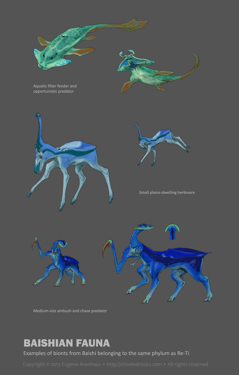
Because this creature was developed with a body plan in mind, it is easy to design more creatures of the same phylum, which would be as diverse as fish, tigers, crocodiles, and birds. Here is a small sampling I generated in less than an hour:


The concept was planned on Dec 25, 2013 during a three-hour car trip to an airport. Most ideas that went into the creature had been devised at that time. Developed between Dec 27 - 29, rendered mostly on Dec 30 and 31, between other tasks.

The development sketches and high-resolution files can be found at http://chiseledrocks.com/main/concepts/reti . The contest submission is here.

Saturday, April 14, 2012

Literalism surrealism

Sometimes, there's nothing like injecting a little literalism into your interpretation to make it surreal.


But with fairy tales, literalism is guaranteed to make your interpretation surreal, as Ursula Vernon discovered for herself.


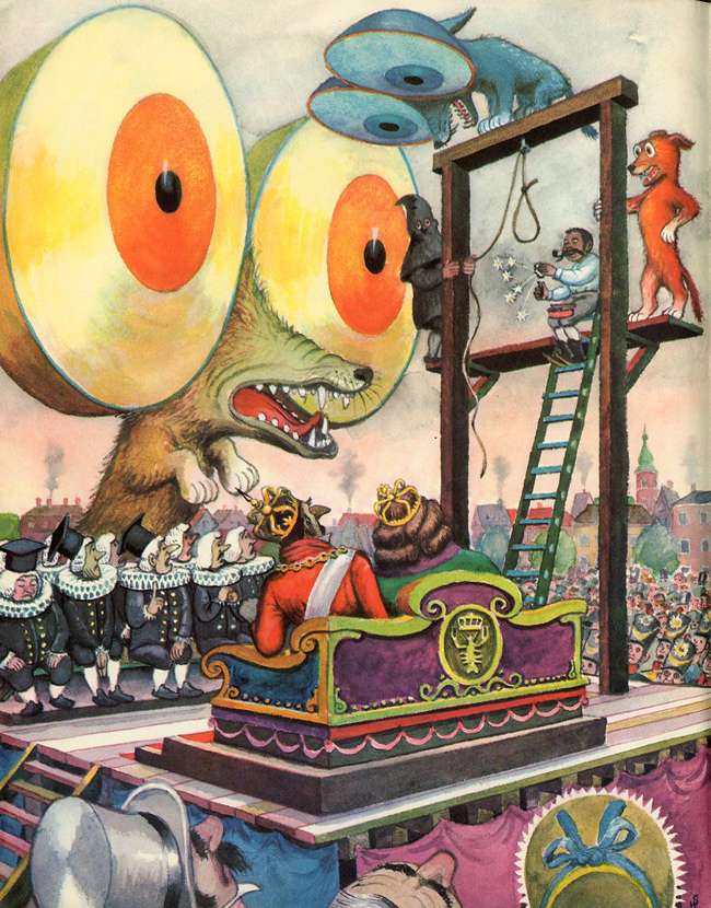
I am sure this was not the way Andersen imagined it when he borrowed the three round-eyed dogs for his version of The Tinderbox... but then Heiri ("Heinrich") Strub comes along and interprets the "eyes as big as the Round Tower" literally and blows everyone's brain up:


Ah, literalism... I love you.


(via 50watts)

Thursday, March 22, 2012

Museum of Not Quite Forgotten Art Supplies

The "Museum of Forgotten Art Supplies" has been making rounds of the web, recently.


What I cannot understand about it is how many of these "forgotten" supplies are actually not forgotten.

Obsolete computers? Marginally fitting the "art supplies" label, but alright, no one is probably using 1984 Macs nowadays. Polaroid cameras and Letraset stickers? Made obsolete by digital stuff; all right.

But ellipse templates and French curves, forgotten? Not only do I have a set hanging next to my desk, but they are still manufactured and sold. Hardly forgotten! Drafting sets? I still have my father's drafting set which is older than I am, still with all tools, and I still use it on occasion. This particular set counts as "vintage" in our day, but I had seen plenty of new ones sold in an art-and-calligraphy store in San Francisco Chinatown, so hardly forgotten by everybody. Razor blades? Rollers? Rulers?..

The book section is even more puzzling. Designing with Type is still in print and not made less relevant by the digital tools. And if they think Andrew Loomis is obsolete or forgotten, they should check out conceptart.org where half the participants, me included, swear by the man's textbooks.

Then they have tape? I cannot work without tape!

It gets weirder when you see that there is a section for pens and pencils.

I am not sure what to think. Perhaps the creator of the museum believes that if any art supply or text is not about computers, it is forgotten. There was no history before 2000!

Still, if you like to ogle art supplies or be reminded about old books on art technique, go check them out.

Monday, February 6, 2012

Your pal, John K.

John Kricfalusi's letter to a young aspiring artist:

Your pal, John K.

Inspirational. I wonder if John was this nice to everyone.