Showing posts with label illustration. Show all posts
Sunday, January 13, 2019
Friday, September 9, 2016
Legend of the One cover process
Sunday, July 19, 2015
African dreams
A teaser for a new exciting project in the works. This is the style, color and texture test.
Stay tuned!
Stay tuned!
Wednesday, September 17, 2014
Saturday, August 9, 2014
Sunday, April 13, 2014
Saturday, March 22, 2014
Dancers
A housewarming gift for a dancer we know locally.
Ink (Kuretake brush and Micron technical pen) on Strathmore drawing paper.
Sunday, February 16, 2014
Old books: Manual of Graphic Techniques
I have a number of old (and sometimes odd) books in my library.
Now, my library is heavily skewed towards books on art, picture books for children, art manuals and reference material. And I love used book shops, so I have accumulated a few old and mostly forgotten specimens of treatises on how to make art.
One of these is the Manual of Graphic Techniques for Architects, Graphic Designers, and Artists by
Tom Porter,
Bob Greenstreet and Sue Goodman. I had first encountered it in a friend's collection, and knew I had to find one of my own.
The Manual is not a single book, but rather a set of four numbered volumes. It was published in 1978.
This is probably the single most disorganized art manual I had ever seen. Its volumes are not thematic; it jumps from topic to topic like a wild antelope, covering bits and pieces on everything from what kinds of pen nibs there are and how to construct the quick-and-dirty perspective plots from an elevation to fine points of silk-screen printing and mixing plaster of Paris. Then it starts all over again, discussing other ways to do perspective plots, page layout for print, using a modelscope and ways to simulate halftone in ink drawings. And so on. Some topics (like silkscreening) are presented only once, but some (like perspective) get sections in several volumes. It is organized somewhat thematically (most of presentation technique is concentrated toward the end, most of the drawing toward the beginning), but is still haphazard enough to make finding something for quick reference a bit difficult.
But what it lacks in organization of material, it makes up in thoroughness. It covers topics from abstract composition and type design to marbling paper, etching glass and tips on working with glue when making models.
Speaking of presentation, the book itself is beautifully designed. It forgoes long text for short, clear snippets with relevant illustrations, arranged in almost comic-book panel layout. The graphics are more reminiscent of technical manuals than of art books, all crisp black and white, relenting for only a few pages to color. Even the typeface the text is set in is reminiscent of a typewriter: each page feels like an architect's presentation. And the condensed but very readable layout matches the very practical content. This is not a theoretical book; it is hands-on and focused on you getting the job done.
That's why I love old books.
Friday, January 24, 2014
Monday, January 6, 2014
Re-ti: creature design for Helpful Bear contest
Helpful Bear is a company at which Terryl Whitlatch works as creature designer. I have admired her work for years, so when they have announced a creature design contest, I decided to take part.
I know that I say I never participate in contests; but this one was not the sort where a company tries to get a lot of designs for a nominal prize. This was a contest by artists for artists, the reward was PR, and it was a chance for creature artists to get together. Just participating in such a contest is already good PR; I went through the complete list of submissions, and the amount of highly skilled and talented artists was impressive.
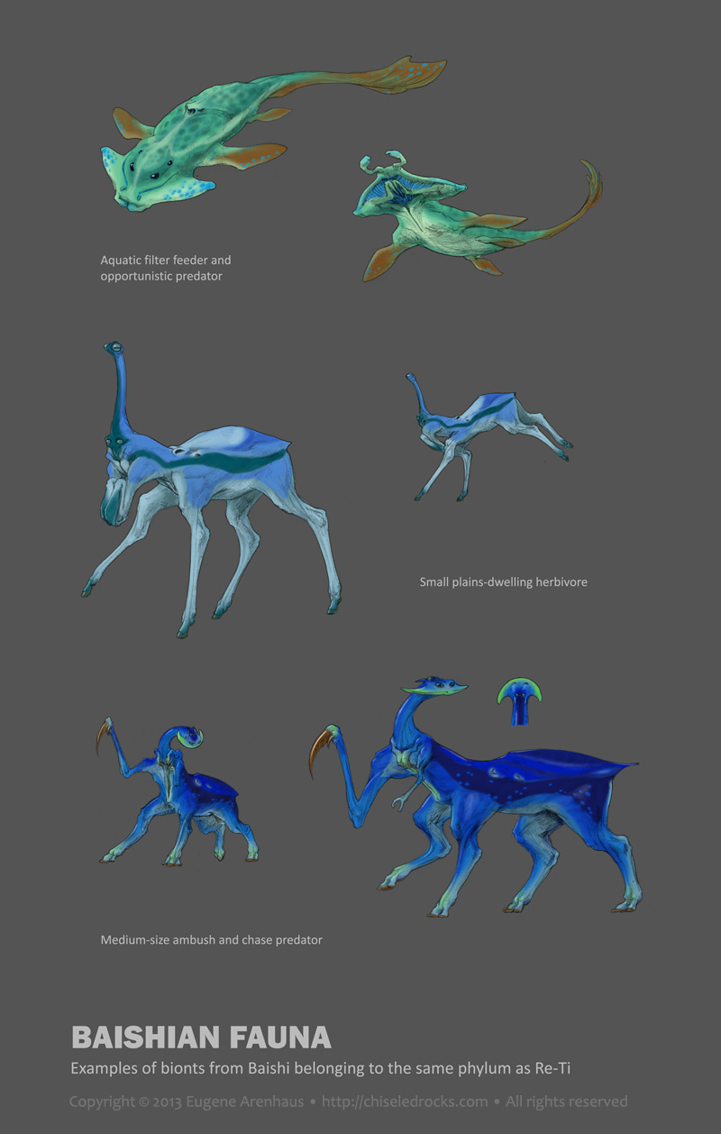
This creature is built on specific design logic, an imaginary Bauplan, if you like. I believe that thinking of evolution of anatomy rather than inventing it straight away, offers more freedom for truly alien creatures than tweaking existing animals or combining their pieces.
Because this creature was developed with a body plan in mind, it is easy to design more creatures of the same phylum, which would be as diverse as fish, tigers, crocodiles, and birds. Here is a small sampling I generated in less than an hour:
I know that I say I never participate in contests; but this one was not the sort where a company tries to get a lot of designs for a nominal prize. This was a contest by artists for artists, the reward was PR, and it was a chance for creature artists to get together. Just participating in such a contest is already good PR; I went through the complete list of submissions, and the amount of highly skilled and talented artists was impressive.
So I
had decided to design something fresh for this contest, a creature that
would be "readable" by us human beings but be completely alien in its anatomy, apart
from the obvious biomechanics. The Re-ti was the result.
It may seem almost Earthly, but if you look closer, few
things are what they seem at the first sight. Its "head" is not the
actual head, its "hooves/suckers" are neither hooves nor suckers, its
muscles can lock up in contracted position which enables it to use
hydraulics for "pushing muscles" along with the more conventional
pulling muscles, it communicates in two-voice tonal song, its hands were
originally copulatory organs, it is neither biped nor a quadruped, in
fact it is not even a vertebrate. Even its real name is unpronounceable for humans: it is a musical note D7, followed by sustained combination of D7 and B7 (hence the short-cut solfege designation of Re/Ti).
But it is still something we hominins
could relate to.
This creature is built on specific design logic, an imaginary Bauplan, if you like. I believe that thinking of evolution of anatomy rather than inventing it straight away, offers more freedom for truly alien creatures than tweaking existing animals or combining their pieces.
It is no paradox; nature always has to work with constraints, base its designs on prior designs, and reassign existing structures to novel tasks. If you set constraints for your creature and try to work with and around them, the result will be more natural, more believable, and in fact more creative than if you begin with unlimited possibilities.
Because this creature was developed with a body plan in mind, it is easy to design more creatures of the same phylum, which would be as diverse as fish, tigers, crocodiles, and birds. Here is a small sampling I generated in less than an hour:
The concept was planned
on Dec 25, 2013 during a three-hour car trip to an airport. Most ideas that went into the creature had been devised at that time. Developed between Dec 27 -
29, rendered mostly on Dec 30 and 31, between other tasks.
The development sketches and high-resolution files can be found at http://chiseledrocks.com/main/concepts/reti . The contest submission is here.
Saturday, April 14, 2012
Literalism surrealism
Sometimes, there's nothing like injecting a little literalism into your interpretation to make it surreal.
But with fairy tales, literalism is guaranteed to make your interpretation surreal, as Ursula Vernon discovered for herself.
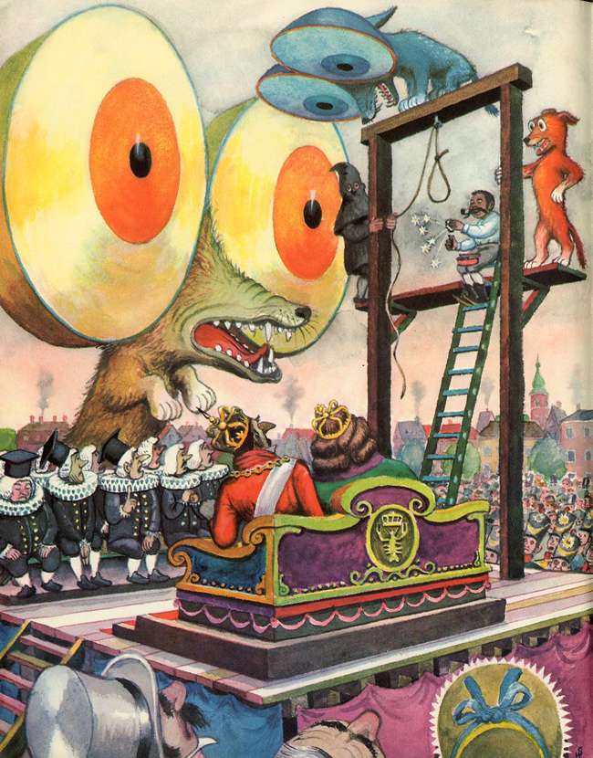
I am sure this was not the way Andersen imagined it when he borrowed the three round-eyed dogs for his version of The Tinderbox... but then Heiri ("Heinrich") Strub comes along and interprets the "eyes as big as the Round Tower" literally and blows everyone's brain up:
Ah, literalism... I love you.
(via 50watts)
But with fairy tales, literalism is guaranteed to make your interpretation surreal, as Ursula Vernon discovered for herself.
I am sure this was not the way Andersen imagined it when he borrowed the three round-eyed dogs for his version of The Tinderbox... but then Heiri ("Heinrich") Strub comes along and interprets the "eyes as big as the Round Tower" literally and blows everyone's brain up:
Ah, literalism... I love you.
(via 50watts)
Thursday, September 8, 2011
The Dark Art of Pricing
In a very rare example of a professional illustrator explaining the pricing process, Jessica Hische, who gave us shouldiworkforfree.com, discusses The Dark Art of Pricing.
She explains why the hourly rate pricing can be detrimental, and discusses pricing for lease of rights (something which, in my experience, a lot of smaller employers aren't versed in — not just illustrators.) She also gives a compelling argument against speculative work, and mentions the "presentation only" pricing (which is another thing that smaller clients and illustrators often are unaware of).
Required reading for any up-and-coming freelance illustrator.
http://www.jessicahische.is/obsessedwiththeinternet/andhelpingyougetpaid/the-dark-art-of-pricing
She explains why the hourly rate pricing can be detrimental, and discusses pricing for lease of rights (something which, in my experience, a lot of smaller employers aren't versed in — not just illustrators.) She also gives a compelling argument against speculative work, and mentions the "presentation only" pricing (which is another thing that smaller clients and illustrators often are unaware of).
Required reading for any up-and-coming freelance illustrator.
http://www.jessicahische.is/obsessedwiththeinternet/andhelpingyougetpaid/the-dark-art-of-pricing
Subscribe to:
Posts (Atom)