Sunday, January 12, 2014

100 years of breeding


I've long thought that a lot of dog breeds suffered grotesque misshaping in the recent years, due to poorly worded standards. Recently it has been happening to cat breeds too. When you have statements like "nose as short as possible", soon the animal's nose is liable to recede behind the eyes - just look at what happened to Persian cats. Even something as innocuous as "chest wide and barrel-like" can distort a bulldog's body into something out of a freak show. Breeds like Cocker Spaniel, Chow Chow, Dachshund, English Bulldog and more have become caricatures of their former selves. And still, breeders will insist that a Pekinese's flat face, which nowadays often requires surgery to let the animal breathe, is "functional" and necessary in "a working breed". (I am not making this up, I heard it stated in an interview.)

Here is a collection of photos showing how distorted some modern breeds really are.

http://imgur.com/a/LVV1A

Perspective can be refreshing. It can also be terrifying.


Friday, January 10, 2014

Re-Ti gets an award

Re-Ti design got an Honorable Mention at the creature design contest!

Here is what they wrote about it:

Spot-on professional orthgraphics and anatomy make this creature easy for a studio production team to build, rig, and animate for a feature, game, or film.

Thank you, Terryl Whitlatch, David Bober and other organizers!

https://www.facebook.com/events/452193294886894/permalink/475657312540492/

Tuesday, January 7, 2014

Remember Tunnel 17!


I had backed the omnibus edition of Ursula Vernon's Hugo-winning Digger on Kickstarter.

And now the book has arrived. And a T-shirt. And stickers. And cloisonne pins. And poster. And extra dust jackets in case the book feels cold in winter.


And, of course, the pickaxe. Never leave your warren without a pickaxe, young wombats, and if you ever think it is not important, remember tunnel 17!


Oh, and I have a picture that I painted in the book, too! Thank you, Ursula!


The volume is literally as thick as a brick. You could probably kill a dead god with it if you accidentally dropped it on top of its black heart. And it is lovingly made, with clear print, appendices, and all cover images. If you want one of your own (and how could you resist?) you can buy it from Amazon.

Monday, January 6, 2014

Re-ti: creature design for Helpful Bear contest

Helpful Bear is a company at which Terryl Whitlatch works as creature designer. I have admired her work for years, so when they have announced a creature design contest, I decided to take part.

I know that I say I never participate in contests; but this one was not the sort where a company tries to get a lot of designs for a nominal prize. This was a contest by artists for artists, the reward was PR, and it was a chance for creature artists to get together. Just participating in such a contest is already good PR; I went through the complete list of submissions, and the amount of highly skilled and talented artists was impressive.

So I had decided to design something fresh for this contest, a creature that would be "readable" by us human beings but be completely alien in its anatomy, apart from the obvious biomechanics.  The  Re-ti was the result. 

Re-ti

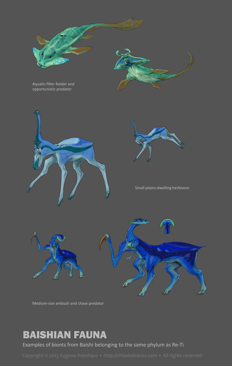
 It may seem almost Earthly, but if you look closer, few things are what they seem at the first sight. Its "head" is not the actual head, its "hooves/suckers" are neither hooves nor suckers, its muscles can lock up in contracted position which enables it to use hydraulics for "pushing muscles" along with the more conventional pulling muscles, it communicates in two-voice tonal song, its hands were originally copulatory organs, it is neither biped nor a quadruped, in fact it is not even a vertebrate. Even its real name is unpronounceable for humans: it is a musical note D7, followed by sustained combination of D7 and B7 (hence the short-cut solfege designation of Re/Ti).

But it is still something we hominins could relate to. 


This creature is built on specific design logic, an imaginary Bauplan, if you like. I believe that  thinking of evolution of anatomy rather than inventing it straight away, offers more freedom for truly alien creatures than tweaking existing animals or combining their pieces. 

It is no paradox; nature always has to work with constraints, base its designs on prior designs, and reassign existing structures to novel tasks. If you set constraints for your creature and try to work with and around them, the result will be more natural, more believable, and in fact more creative than if you begin with unlimited possibilities.

Because this creature was developed with a body plan in mind, it is easy to design more creatures of the same phylum, which would be as diverse as fish, tigers, crocodiles, and birds. Here is a small sampling I generated in less than an hour:


The concept was planned on Dec 25, 2013 during a three-hour car trip to an airport. Most ideas that went into the creature had been devised at that time. Developed between Dec 27 - 29, rendered mostly on Dec 30 and 31, between other tasks.

The development sketches and high-resolution files can be found at http://chiseledrocks.com/main/concepts/reti . The contest submission is here.

Saturday, April 14, 2012

Literalism surrealism

Sometimes, there's nothing like injecting a little literalism into your interpretation to make it surreal.


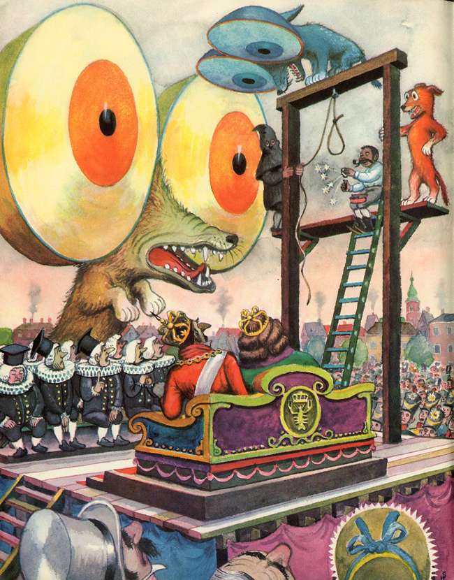
But with fairy tales, literalism is guaranteed to make your interpretation surreal, as Ursula Vernon discovered for herself.


I am sure this was not the way Andersen imagined it when he borrowed the three round-eyed dogs for his version of The Tinderbox... but then Heiri ("Heinrich") Strub comes along and interprets the "eyes as big as the Round Tower" literally and blows everyone's brain up:


Ah, literalism... I love you.


(via 50watts)

Thursday, March 22, 2012

Museum of Not Quite Forgotten Art Supplies

The "Museum of Forgotten Art Supplies" has been making rounds of the web, recently.


What I cannot understand about it is how many of these "forgotten" supplies are actually not forgotten.

Obsolete computers? Marginally fitting the "art supplies" label, but alright, no one is probably using 1984 Macs nowadays. Polaroid cameras and Letraset stickers? Made obsolete by digital stuff; all right.

But ellipse templates and French curves, forgotten? Not only do I have a set hanging next to my desk, but they are still manufactured and sold. Hardly forgotten! Drafting sets? I still have my father's drafting set which is older than I am, still with all tools, and I still use it on occasion. This particular set counts as "vintage" in our day, but I had seen plenty of new ones sold in an art-and-calligraphy store in San Francisco Chinatown, so hardly forgotten by everybody. Razor blades? Rollers? Rulers?..

The book section is even more puzzling. Designing with Type is still in print and not made less relevant by the digital tools. And if they think Andrew Loomis is obsolete or forgotten, they should check out conceptart.org where half the participants, me included, swear by the man's textbooks.

Then they have tape? I cannot work without tape!

It gets weirder when you see that there is a section for pens and pencils.

I am not sure what to think. Perhaps the creator of the museum believes that if any art supply or text is not about computers, it is forgotten. There was no history before 2000!

Still, if you like to ogle art supplies or be reminded about old books on art technique, go check them out.

Monday, February 6, 2012

Your pal, John K.

John Kricfalusi's letter to a young aspiring artist:

Your pal, John K.

Inspirational. I wonder if John was this nice to everyone.

Tuesday, November 8, 2011

Jon Schindehette writes about standing out

Art director Jon Schindehette wrote this about the current concept and fantasy art scene:

So often when I attend a convention and wade through hundreds of portfolios in a weekend, I am struck by the “sameness” of them all. So many folks have the same look, the same style, the same mark making techniques. It’s almost as if there is this fantasy/sci-fi Photoshop filter running around the internet. < . . . > At the end of a long and tiring con, do you think I remember the one guy that excelled at the predominate style? Maybe. But I can guarantee that I remember the folks that stood out from the crowd – the amazing gouache artist, the stellar water-color artist, the person that was doing something in Photoshop that I had never seen before. Nope, I didn’t really remember anyone that had applied the SFS Filter to their work. They just didn’t stand out.

It's true for any art scene from any age.  Many people copy, but few people dare to invent. For every Rembrandt or Vermeer, there are a thousand Dutch painters who were producing the same run-of-the mill stuff. It's just that we get to see everything that is in vogue today, but to see those Dutch run-of-the-mill products you have to go to third-tier museums that cannot afford Rembrandt. The same will eventually happen to the artists of our times.

The full article link:  http://theartorder.com/2011/08/26/differentiate-or-die/

Thursday, November 3, 2011

Giving retired cells the boot

It turns out that a big part of the condition associated with old age is due to accumulation of the "ballast" cells at the end of their useful life. The immune system does remove them, but not quickly enough, so the longer you live, the more of those you keep. They secrete various chemicals and impede the function of your organs.

Now someone has shown a relatively simple way to get rid of them (in mice), and the results are interesting. Treated mice don't live longer, but their tissues stay younger.

The blogs are buzzing about this piece of research today. The claims, understandably, have gone a bit wild. Here is an article that provides some perspective:

http://blogs.discovermagazine.com/notrocketscience/2011/11/02/extending-healthy-life-by-getting-rid-of-retired-cells

In short, a treatment like this won't make you live longer as many seem to claim, but it will make you stay in better shape longer and let you get more out of your years. Which is a big deal, so all the people who dismiss it as "irrelevant" are missing the point.

I hope this gets out of lab and into human tests soon.

Wednesday, October 26, 2011

Thursday, October 20, 2011

Art Picks: Wind


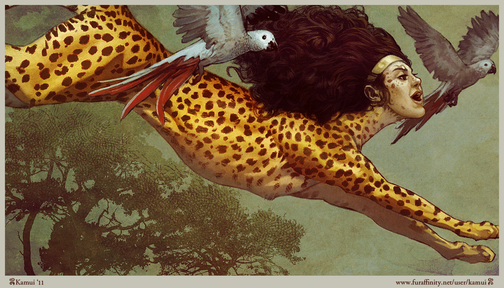
The Wind by kamui (I have no other info on this artist)


What makes this picture work
Great bold composition and smart use of the medium.
The diagonal composition always looks dynamic, but here it is enhanced by the arrogant frame cropping and making the top half of the canvas the focus. The leaping sphinx is almost (the key point is, almost) too big for the frame, which reminds the viewer of a lucky snapshot photograph, further enhancing the dynamic effect. The two parrots help fill the space, as well as create and enhance secondary lines of action, "pulling" the sphinx along.
The lower half is filled with silhouetted trees, which underscore the height of the sphinx's leap and balance the composition without distracting the viewer's attention. Skillful use of texture and brushstroke is remarkable; they enhance the points of interest but never become a point to show off. The hair is lushly textured, but the spots are sketchy and don't distract from the feline body form. The front parrot is detailed, but the back one is subdued and sketchy. The trees are actually a posterized photo, but the collage technique is used so subtly and altered by hand, you would never realize that. Everything is used in moderation. Even the color is subdued and neutral to bring out the gold in the sphinx.

Incidentally, the sphinx is clearly a close relative to the one in Khnopff's Caress. It's good to see cultural allusions like this.

What could be improved
Cohesion could be better in some places. The artist clearly used photographs here, and used them well, but if you look at the way the head is attached to the neck, you could see that the forms and anatomical structures do not quite mesh believably. A part of it is the angle of the head, turned towards the viewer rather than forward. That might have been an artistic decision or limited by available photograph. But in either case the artist should have thought of where the muscles attach, rather than follow the reference to the letter.

Like this? Follow my blog for more Art Picks, or Like it on Facebook!

Friday, October 14, 2011

Pre-next con: iCON

There is an exhibition of my works at iCON in Tel Aviv's Eshkol Pais building, starting Sunday. If you are in the area, drop by.

Sunday, October 9, 2011

Who watches the supermen


It might seem at the first glance that the protagonist of Alan Moore's Watchmen is Dr. Manhattan, and the book's focus is exploration of what it would truly mean to be superhuman. If you look deeper, it is not quite so.

True, a great deal of the book focuses on Dr. Manhattan's origin story, current situation and growing awareness of his detachment from humanity that culminates in him leaving Earth in the end. However, there are two other characters who get nearly as much attention, and more history. They do not pain themselves over their loss of humanity like Dr. Osterman or manipulate the world like Veidt, react to Kovacs's story like Dr. Long or provide a human outlook on the events like Dreiberg, Juspeczyk and the two Bernards. These two merely frame and underlie the whole story as we see it.

Both of them are monsters.

There is more than one way to be a monster, though, and these two are as different as two psychopaths can be.

The Comedian is the extremely human monster, uninhibited, amoral, murderous, lecherous, a troglodyte with heavy weapons. He has no principles, only impulses and cunning; he is not even an anarchist, and sells out to the government so he can continue the debauchery with an official blessing. It seems that there is nothing too heinous for him to do; when the retired heroes assembled for his funeral remember his presence in their lives, they remember him raping, killing, destroying, cynically abusing everyone. His impulsive depravity hits the truly monstrous bottom when he shoots a woman pregnant with his own child without regret. And yet there are people who were his friends and mourned him.


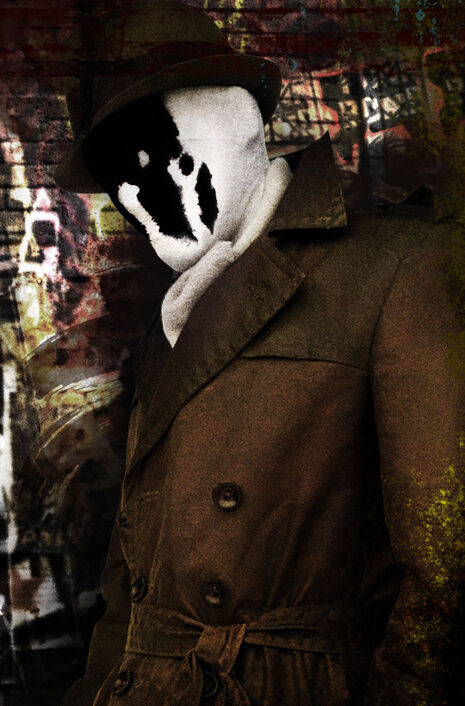
Rorschach is the polar opposite, cold, calculating, preternaturally focused, the only feeling he cultivates is the fanatical feeling of justice. He has no impulses, only intellect and principles to uphold which he stops at nothing; Rorschach is a survivor, rather than an aggressor, but to ensure his survival and enforce his principles he commits atrocities and disregards anyone else's well-being... for as long as it serves his goals, then he simply walks away.  Ultimately, his principles prove to have priority over his own survival. He had honed himself into a ruthless, efficient avenging entity, becoming almost inhuman. He's as amoral and cruel as the Comedian, except rather than simply disregarding the social convention, he follows a moral of his own design which is incompatible with anyone else's. And yet there are people who were his friends and mourned him, too.

The two human monsters, one sunk to the monstrous state by following his impulses, the other elevated to the same monstrous state by following his ideals, are the two extremes of human condition in the book. Every character has a little of the Comedian in them. Every character has a little of Rorschach in them. The Rorschach-like detachment of Dr. Manhattan mingles with things he did in Vietnam on the Comedian's side. Ozymandias's Rorschach-like idealism pushes him to calculate odds at which killing millions to save billions becomes acceptable, but like the Comedian, he destroys witnesses in mass murder and kills people with his own hands. We all have potential to become the Comedian. We all have potential to become Rorschach.

The Comedian dies when he discovers the true cynical monstrousness of organized atrocity that even his decades-cultivated cynicism could not bear, and it finally breaks him like any human who saw too much injustice. Rorschach dies when he puts his principle of justice and truth above his own survival, refusing to lie even to save himself and tell the truth later, like any human who would rather die than face a lifetime of knowing they betrayed their ideals even for an instant.Their pursuits of debauchery and ideal, running in the opposite directions, still brought them together in death. The two monsters die human deaths, never having escaped the humanity that caught up with them in the end.

Their symmetrical deaths, the Comedian's at the beginning and Rorschach's at the end, frame the book and the human perspective on what it means to try to be superhuman.

Wednesday, October 5, 2011

Bill Watterson: early comics


College comics by Bill Watterson, pre-Calvin-and-Hobbes. Take a look.

And here is a whole bundle of Watterson's early work.

Sunday, October 2, 2011

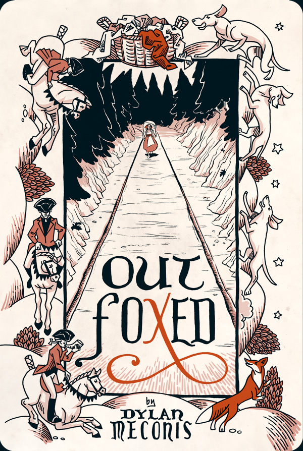
Outfoxed


Clothes may not make a man, but they can make a fox something else in online comic Outfoxed by Dylan Meconis.